Looking back at your preliminary task, what do you feel you have learnt in the progression from it to the full product?
Looking over the final cut of our title sequence I feel like I have learnt a lot and have come a very long way considering the reviews we got for the draft of our sequence, our first draft wasn't very well edited and got a lot of bad feedback, luckily we quickly managed to sort this out and am very happy with our new sequence, I am also very proud of me and Nicole as we managed to edit our sequence within a matter of days, which is something we didn't think we would be able to do, especially as us neither of us were experienced with Final Cut Pro and the way it works. I feel with this considered our sequence has turned out very well.
During the project we experienced a few problems, for example we had a great idea for the sequence that we all loved and really wanted to do, but it didn't fit with our original film idea, this meant we had to change our whole film idea and had to do alot more work to get the right information about our new film genre and we had to make sure our blogs were up to date with all the new information and that we were all clear with the new idea.
Throughout this project I have learnt a lot. I have mainly learnt about editing and how to use Final Cut Pro, this was the thing I was not comfortable with using and did not know how to use it at all, however I am now comfortable with the way Final cut pro works and how to use it, and could easily use it again in any other projects. I also learnt about the importance of planning ahead and planning everything correctly, within my group we planned well but not as well as we could've, we could've planned more about who was going to bring what when we were filming and what was happening in general, I learnt that its the small details like that that can make a lot of difference and if I were to do this project again I would make sure that everyone in the group knows what is happening and we all know what we are doing.
Wednesday, 16 April 2014

Evaluation question 6.
What have you learnt about technologies from the process of constructing this product?
To film the title sequence we used Esther's DSLR camera, as a photography student I am fairly familiar with how DSLR's work and how to use them but I had never used one to film before, just to take pictures so I was fairly new to using them to film, however I adjusted easily and quickly worked out how it worked.
However something I wasn't used to was Final Cut Pro which is what we used to edit the sequence. I had used Final Cut Pro once before when we edited our continuity sequences but I couldn't really remember much of what we had been taught so Nicole & myself both worked out what we had to do using trial and error, luckily we managed to work everything out fairly quickly and soon managed to edit our title sequence.
We used a tripod to make sure none of the shots were shaky, however after our first shoot we found that a few shots were shaky which meant we had to film again, if we had access to one a steadicam would have been better for the shots where the camera is moving or following the actors, that way we wouldn't of had to film again as the shots wouldn't have been shaky.
We also used photoshop to create our company logo, luckily both myself and Nicole are fairly experienced with photoshop and both know how to use it, however Nicole is more creative and alot better at using photoshop than me, so I left that to her.
Evaluation question four.
Who would be the audience for your media product?
We decided that the audience for our film would be females between 12 & 24 years old. We chose this age range because after doing some research and looking into other films of the same genre we found that most of these films were watched by teenagers aged from 13 to 24, so we thought the most accurate way to set a target audience for our film would be to go off of what films within the same genre had set theirs as.
Another reason we chose this age range is because they are the people who are most likely to have money to spend and time to actually go out and see a film. 12/13 is usually the age where you are just starting to get pocket money for doing household chores, so people around that age will have money to spare as they don't need to spend their money on things like bills, food and clothes as they are still young enough for their parents to do that. 16/17 is the age where you are likely to be having a first job so you will have money to spend on more leisure activities like going to the cinema. Lastly 18-24 year olds are most likely to be in stable jobs and will have a fair amount of spare money to use on leisure activities
The reason we decided females would be the main target audience is because they are the most likely to see teen drama/chick flicks and as thats what our films genre falls under we decided that females would most likely watch it.
Evaluation question two.
How does your media product represent particular social groups?
Our title sequence represents social groups such as teenagers in a fairly negative way. Throughout the entire sequence you can clearly see the different stages of the social ladder. You have the outsiders/unpopular kids, the cool/popular kids, the bullies and those inbetween. Although we have mainly stuck to the typical popluar girl trend we have slightly altered it. We didn't really want our main character to be as stereotypical as the rest and chose to make the main character; the popular girl, quite alternative. She enjoys listening to rock bands and wears something stereotypically an 'outsider' would wear. I like this idea because it changes things a bit and shows that typically unpopular people can be one of the popular kids if they tried.
However with the rest of the characters we have stuck to the stereotypes. A main boy being tall and awkward and clearly not having many friends as he walks alone, and the background characters (the bullies, the inbetweeners) just as you would imagine them to be.
Evaluation question one.
In what ways does your media product use, develop or challenge forms and conventions of real media products?
After discussing in our group and coming up with some initial ideas for films we decided a teen drama was most suited to us. Our title sequence is like a short film in itself as it outlines the main plot of the film in a short amount of time and without all the details.
After analysing and watching many title sequences based around this genre I found that telling a story or the title sequence being part of the story was very popular and we found as a group that is what we all wanted to do with our own sequence. We also found from analysing teen drama and chick flick title sequences that a very popular choice of music was an acoustic guitar or something that was fairly upbeat and seemed happy. We also found that some of them had the main characters voice as a voice over narrating the story, but we thought this would be difficult to do as we were only making the title sequence and not the whole film, however it is something I would like to try if I were to do this project again.
Friday, 4 April 2014
Thursday, 20 March 2014
Things to be improved.
After the classes feedback we discovered a few issues with our title sequence. We found the main comment that appeared on all of the feedback sheets was the fonts and the colour of the fonts. This is something that can easily be changed and can be fixed pretty easily. We also discovered that a few people were confused by what the narrative was, this can be fixed by changing the order of the clips.
The thing I personally disliked about the sequence was the trasitions. I don't think they worked very well and made the narrative confusing and hard to follow.
The thing I personally disliked about the sequence was the trasitions. I don't think they worked very well and made the narrative confusing and hard to follow.
Wednesday, 19 March 2014
Journal: Feedback
In today's lesson we all watched each others title sequences, this was a really great experience as it gave us all the chance to see how creative everyone else was and to see what their interpretation of the task was. There are some really amazing pieces of work that the class has produced and after watching theirs and comparing it to ours, I think we have noticed a few problems with ours that we can hopefully fix by the deadline.
These are the feedback sheets we got from the class:


These are the feedback sheets we got from the class:
Fonts
When doing a title sequence the fonts are always an important part since thats how people read the credits. During one of the lessons Nicole went onto Dafont.com to look for some fonts that would be appropriate for our title sequence, since there were a few that she liked, she wrote up a survey and handed it out to everyone in the class, asking them their favourite of the 4 fonts and which colour they think would look best.

The results were:
The results were:
Fonts:
Always Forever (3/10)
Jenna Sue (4/10)
Jennifer Lynne (2/10)
Sweetie Pie (1/10)
Colours:
White (5/10)
Purple (2/10)
Dusty Blue (1/10)
Red (2/10)
Monday, 17 March 2014
Personal analysis: My mad fat diary.
My Mad Fat Diary is TV series based on the book 'My fat mad teenage diary' by Rae Earl. It was turned into a TV series in January 2013 & has already made a comeback for series 2. The show follows the story of 16 year old girl called Rae Earl, who has just left a psychiatric hospital, where she has been for four months. When Rae leaves the hospital she begins to reconnect with her bestfriend Chloe and her new group of friends, however she doesn't tell them about where she has been for the past four months and sneaks off once a week to meet her therapist. Her therapist tells her to keep a diary which is what is read as a voice over.
My Mad Fat Diary – title sequence from Mr & Mrs on Vimeo.
The reason I have decided to analyse the title sequence for this show is because the main character in my mad fst diary (Rae) is very similar to the main character in our film. They are both highly influenced by music and both follow bands and they both have a tight group of friends. I also thought it would be interesting to see the difference between a film title sequence and a TV show title sequence.
The first thing we see in the sequence is a note with 'This Diary belongs to Rae Earl Private!' written on it, there are also some doodles of pizza and a girl on there. These are already clues to what the main character is like, these both show us she likes food and that she doesn't think very highly of herself as the drawing that is possibly of her, isn't drawn very neatly and didn't take much time. This also suggests that she doesn't care much for her appearance. Black scribbles then cover the outside of the note, this could suggest that her mental state isn't very well because she is using black and scribbling could connote that her thoughts are all 'scribbled'.
 The next thing we see is a note with 'Mum' & a witchs face scribbled on it. This suggests that she doesn't get on with her mum particularly well. The receipt with chocolate repeated in the back tells us that she is not the healthiest girl ever and is quite large.
The next shot is of a pair of sunglasses which could imply that the area it is set in is sunny or that it is set in the summer when its hot. There is also a doodle of a naked lady which could imply that Rae is going through puberty and doesn't have anyone to share things about that with other than her diary.
We then see a doodle of her therapist Kester. The drawing is quite large which suggests that she thinks very highly of him and enjoys spending the time she can talking to him.
The title then appears and then a shot of spilt ink with 'based on my fat, mad, teenage diary by rae earl' written on it.
The next scene is a note saying 'lets do this' this suggests that she is trying to get used to trying new things and wants to live more. There is also a tape in the corner, this shows how much music means to her, the fact that the name 'Finn' is also written at the bottom suggests he is going to play a big part in Rae's life.
There is then a few doodles of birds which could suggest she feels more free than she ever has before With song lyrics/poetry written on some paper. This again shows how musically influenced she is.
The music then fades out and a shot of Rae appears.
Sunday, 16 March 2014
Music.
In our title sequence there is no talking so music is a key feature. During one of our double lessons while Esther was editing the footage we had Nicole and I went onto a computer each and started to look for some music that we thought would be good to use. We first tried youtube for uncopyrighted music but didn't have much luck. We then went onto soundcloud & freeplaymusic.com to look for something that would be appropriate for our sequence, this time we managed to find quite a few that we both liked. After a little while of searching we both came together and listened to what each other had found. We then discovered that we both really liked an artist we had found on freeplaymusic called 'Lisa Jaeggi'. After spending a while listening to all of her songs we discussed which one we liked best and we found we both really loved her song 'Better The Devil You Know' and we all agreed that it fitted our sequence perfectly.
We are sure that this song is uncopyrighted however we thought it would be nice to email Lisa Jaeggi herself to see if it was perfectly okay to use her song, unfortunately we haven't had a reply back from her but we have done our research and can find no reason to not use it.
The email we sent read:
'Hi,
We are Welling school pupils and for our A Level Media coursework we are making a title sequence for a film that we have created. We were instructed to use a piece of either uncopyrighted music or music we have had permission to use by the writer. We found your song 'The Devil You Know' on the website https://www.freeplaymusic.com/ and were wondering if you could grant us permission to use your song, which fits in really well with our sequence.
Many Thanks,
Chloe Ridley
Nicole Simmons
Esther Sole'
Filming journal 3: In school
Th next time we did some filming we were in school. I personally found doing it in school was alot harder than outside of school. When we filmed at Danson Park we could use all the time we needed to get everything done, however in school we were working on a tight schedule due to different timetables & different lesson times. What also made it difficult was that the people we needed to act in the sequence were sometimes unavailable and couldn't do it due to having their own work to do. If the people we needed were absent or had other commitments that day we were unable to film the things we needed. Unfortunately this happened more than once. During the times this did happen we would get together as a group and discuss what we would do next and when everyone was available to film next. Luckily we managed to sort out dates & times between us and the people acting in our sequence & managed to film everything we needed,
Although there were quite a few downsides to filming in school, there were some up. For example, there were always extra people around if we ever needed any and if we needed any extra support/advice there were always the people in our class we could talk to anytime and there were always the teachers we could ask any of our questions to and get advice from.
Overall I found the experience of filming inside of school to be a little more difficult than originally anticipated, however I feel we managed to successfully overcome these issues as a group.
Danson Park re-shoot
While editing the footage we shot at Danson Park we found that some of the shots were not as good as we had originally thought. This meant we had to re-shoot & get it all done as quickly as possible, It was quite hard to decide a date to film as we all had other commitments for the coming weekend, so we were unable to do it then, this meant we had to do it on an afternoon after school. We decided on the coming Friday.
On Friday after our Media lesson Nicole & I got permission to leave school early to go to her house to get the costume & props that we needed, we then met Esther at Danson park at 3.30 where she was ready for us to begin filming. Luckily it didn't take very long for us to know exactly what we wanted & exactly how it should look. Overall it took around 1 hour 30 minutes to shoot everything we needed.
I feel this was a very successful shoot & we are all very pleased with the way the footage we filmed has turned out.
Friday, 14 March 2014
Filming Journal
We began to film our title sequence on Wednesday 19th February. We chose this day because it was the beginning of half term and if some of the shots were't so great we could easily just go back out later on in the week and re-shoot them, luckily there was no need for this as we managed to get all the shots we needed that day.
For our first time filming I feel it was very successful. We had all the costume, props and camera equipment we needed, and managed to get all the shots we could do in a matter of hours, we also had a lot of fun and got to know each other a bit better.
As a group we decided to meet at 11.30 in Danson Park, which is where a lot of our sequence takes place. We decided that Danson Park would be a good place to film because its a big open space but it is still quite central so if we needed to get anything it would be easy enough for one of us to go home/go to a shop and get whatever we needed, luckily we were all prepared for the day ahead and didn't need to waste any time running around getting things we may have needed.
To film our sequence we used Esthers camera, we came together as a group and decided to use Esthers camera because it is the best quality camera and we would always have access to it if we needed to film anything again. We also used a tripod to make sure none of the shots were shaky and that we made sure the camera quality was at its finest, unfortunately it was a fairly windy day so some of the shots were a little bit shaky, which meant we had to go back to Danson Park at another date and re-shoot some of them to make sure they were the best we could do and the best shots we could get. Luckily we managed this and also got some extra shots we had been advised to do, so in the end it turned out to be a good thing that some of the shots were shaky otherwise we wouldn't have had the shots at the best quality.
We all worked together as a team to get the shots we needed. Nicole plays the main character in the film so she was acting, she also provided the costume. Esther provided the camera & tripod and I bought the storyboard and other papers that we needed.
Overall I think it was a successful day filming, even though we had to do some of the shots again it was still really good to get an idea of how we well we would work together when we are filming and how long everything would take and how well the shots would turn out. However, if we were to re-do this in the future I think would be a better idea to make sure that we checked how windy it would be to make sure it wont interfeir with the quality of the film.
Tuesday, 25 February 2014
The Main Character


The main character in our film is a teenage girl in her last years of secondary School, she is quite a popular girl and gets along with everyone in the school. In her spare time she listens to music and likes to spend alot of time with her friends watching movies and just talking, when shes not with he friends she likes to sepnd her time on social media websites and watching her favouite tv shows.
Her fashion sense isn't very popular but she is a very care-free person and does what she wants. She wears alot of tshirts made by her favourite bands and tv shows on and very rarely follows any fashion trends there may be. She also wears skinny jeans and owns several pairs all in different colours. She also owns many, many pairs of converses and likes to wear a different pair everyday. She also tries to change her nail varnish colour very week.
Tuesday, 11 February 2014

Saturday, 8 February 2014

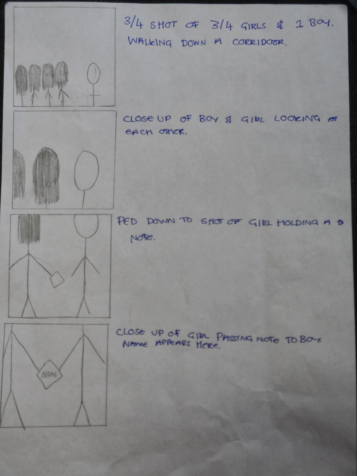


Wednesday, 5 February 2014
The importance of Typography
Today in class we discussed why the font used in a film's title sequence is so important. We looked at several titles sequences and as a class looked at how that reflects the film.
One of the first things we discussed was sans serif and serif fonts. Sans serif fonts are fonts without serifs (the edgy bits) at the end of strokes, these fonts are commonly associated with western/FBI/police films. Serif fonts are the opposite; fonts with serifs at the edge.
The first title sequence we looked at was the 'Catch me if you can' title sequence. http://www.artofthetitle.com/title/catch-me-if-you-can/
 We found that the flow from each of the names was very smooth but there was constant movement, the smooth constant moving could represent the main character in the film. He is always changing his identity, however he is smooth so that nobody notices what he is doing, another thing that gives us this idea is the fact that throughout the title sequence the main character is seen in many different occupations, suggesting he is always moving and always changing. The font used is also a Sans serif font which again suggests the main character is smooth. We can also notice that this title sequence has been influenced by Saul Bass as there are alot of straight lines used to fit into the scene, which is similar to what Saul Bass does.
The next title sequence we looked at was the 'Lord of war' title sequence. http://www.artofthetitle.com/title/lord-of-war/
 In this title sequence the names of the big stars and the main crew are focused to the centre and the other cast & crew are not as noticeable as they are put to the side. We also noticed that the writing is white and fairly small, this means that it is not the main focus, when we watched it we all found ourselves focusing on the story of the bullet in the background and not what the text was saying. The text itself is also in capital letters which suggests the seriousness of the film.
Th next and last title sequence we looked at was 'Forrest Gump' http://www.artofthetitle.com/title/forrest-gump/
 Throughout this entire sequence the names were centred, this shows that is what the audience is supposed to be focusing on. The font used is a serif font, this suggests the film is set in the past as serif fonts are associated with the past and old newspapers. The background is also not too busy so it is easy to read. There is also a very gentle feeling to the sequence, the fact that there is also a feather floating around in the background makes this calm and gentle than the other two sequences we watched.
One of the first things we discussed was sans serif and serif fonts. Sans serif fonts are fonts without serifs (the edgy bits) at the end of strokes, these fonts are commonly associated with western/FBI/police films. Serif fonts are the opposite; fonts with serifs at the edge.
The first title sequence we looked at was the 'Catch me if you can' title sequence. http://www.artofthetitle.com/title/catch-me-if-you-can/
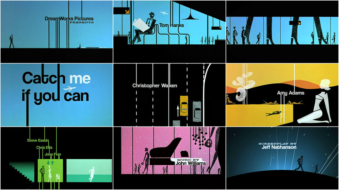 We found that the flow from each of the names was very smooth but there was constant movement, the smooth constant moving could represent the main character in the film. He is always changing his identity, however he is smooth so that nobody notices what he is doing, another thing that gives us this idea is the fact that throughout the title sequence the main character is seen in many different occupations, suggesting he is always moving and always changing. The font used is also a Sans serif font which again suggests the main character is smooth. We can also notice that this title sequence has been influenced by Saul Bass as there are alot of straight lines used to fit into the scene, which is similar to what Saul Bass does.
The next title sequence we looked at was the 'Lord of war' title sequence. http://www.artofthetitle.com/title/lord-of-war/
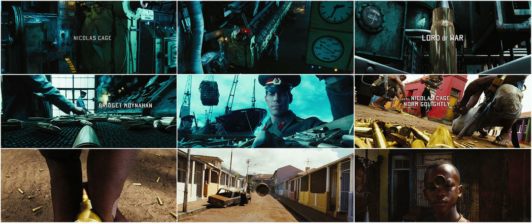 In this title sequence the names of the big stars and the main crew are focused to the centre and the other cast & crew are not as noticeable as they are put to the side. We also noticed that the writing is white and fairly small, this means that it is not the main focus, when we watched it we all found ourselves focusing on the story of the bullet in the background and not what the text was saying. The text itself is also in capital letters which suggests the seriousness of the film.
Th next and last title sequence we looked at was 'Forrest Gump' http://www.artofthetitle.com/title/forrest-gump/
 Throughout this entire sequence the names were centred, this shows that is what the audience is supposed to be focusing on. The font used is a serif font, this suggests the film is set in the past as serif fonts are associated with the past and old newspapers. The background is also not too busy so it is easy to read. There is also a very gentle feeling to the sequence, the fact that there is also a feather floating around in the background makes this calm and gentle than the other two sequences we watched.
Subscribe to:
Posts (Atom)