Tuesday, 28 January 2014

Conventions of a title sequence.

A title sequence is the method by which a film credits production & cast members utilizing visuals and sound. The opening credits list the most important members of the production & they are either on a black screen or over action. There may or may not be accompanying music. The aim of an opening sequence is to establish characters, settings, & genre.

Usually a title sequence will contain:

  • Details of the cast and crew
  • The films title
  • An introduction to the characters or character type
  • Indication of place
  • Indication of historical period
  • Information regarding mood & tone
  • Introduction to signature theme tune
  • Information about genre
  • Questions that the viewer finds intriguing (sets up enigmas)
  • Patterns & types of editing that will be echoed in the remainder of the film
  • Mise en scene & cinematography that will be echoed or elaborated upon later in the film.
Common credits in a title sequence:

  • Name of production companies 
  • Producer 
  • Name of title
  • Director 
  • Other key crew
  • Executive producer 
  • Top billing actors

S.T.I.N.C.S.

S.  Setting: Where & when is this film set?
T. Theme: What is the mood of the film?
                   What is the film really about?
I.  Iconography: Costumes, Makeup, Props, etc, relevant to the genre.
N. Narrative: What is the story about?
C. Characters: Who are they?
                         What will they be like?
S. Style: Cinematography, sound, editing.
               What will the film look & feel like?


Saturday, 25 January 2014

Barthes' Enigma theory

Barthes' enigma code is a theory that suggests a media text portrays a mystery to draw an audience in, pose questions & as such, become intrigued in the piece. For instance, a murder mystery will often not reveal the identity of the murderer until the end of the story which poses the question, 'who is the murderer?'

Barthes' theory of the 5 codes is a way of grouping signifiers according to the role they play in the text.
These are categorized as:

  1.  The Hermeneutic Code- The voice of truth, This is an element in a story that is not explained, & therefore exists as an enigmas for the reader, raising questions. 
  2.  The Proairetic Code- The voice of empirics.
  3.  The Semantic Code- The voice of the person.
  4.  The Symbolic Code- The voice of the symbol.
  5.  The Cultural Code- The voice of knowledge. 


Personal Analysis: The perks of being a Wallflower.

The Perks of being a wallflower is a film based on the novel by Stephen Chbosky. It is about a 15 year old boy called Charlie. Charlie is an outsider in high school and struggles to make friends, especially after the suicide of his best friend & trying to cope with mental illness, this is until 2 seniors (Sam & Patrick) take him under their wing and help welcome him to the real world.
The reason I have chose to analyse this titlesequence is because some of the genres featured are similar to ones we are using in our film, for example, Romance & Drama.
The first thing we see in the title sequence is the production companies names (Summit entertainment).
We then see a black screen with 'summit entertainment presents' in typewriter font, in the background there is also the noise of someone typing on a typewriter, this suggests that the main character enjoys writing and maybe aspires to be a writer. This also suggests that a typewriter is going to be a key feature in the film, and something we can expect to see alot of. This is followed by 'a mr. mudd production', this is still sticking to the typewriter font & sound.
The next thing to appear are the stars names. This may make the audience think of previous films these actors have been in and what their characters might be like and how different they may be compared to other films they have seen with this actor in it.
The song 'Could it be another change?' by The Samples begins to play as the title appears. I think this song was chosen because the film is about being a 'wallflower' (a wallflower is  a shy or unpopular individual who doesn't socialize or participate in activities at social events) and by choosing a song that isn't popular goes along with the theme of the film. The title of the song also matches the film. Throughout the film the main character Charlie goes through alot of changes and discovers alot about himself, therefore the title of the song is extremely appropriate to what the film is about. 
The title then fades into blackness and we begin to see moving lights, we can almost immediately assume these are in a tunnel. The fact that this location is featured suggests that it features once again in the film and is a key part for the audience to recognise. Later in the film we find out this location is of some importance to the 3 main characters and has an awful lot of meaning. The travelling through the tunnel continues as names of cast and crew appear on the screen in the typewriter font.

After several shots of the tunnel we are met with darkness and then a reflection of the main character, Charlie, in a window.  We then hear Charlie speaking, it is obvious from the start that he is writing a letter to someone, however we arent sure who, this is something that as an audience we will never find out. We find out alot about Charlies character after a few seconds of hearing him. We discover that he has spent time in hospital, has very little self-confidence and is quite introverted. We then find out it is Charlies first day at high school the next day, this tells us is he around 14/15 years old. There is then a shot of charlie in the school hallway, this is where the title sequence ends, from this short amount of time we have been able to learn alot about Charlie and who he is. 

Personal analysis: Saul Bass- Walk on the wild side.

http://www.artofthetitle.com/title/walk-on-the-wild-side/
The first thing we see in the title sequence for walk on the wild side is the production company names. However the first thing we notice is the music. The music has a sense of mystery to it making the audience wonder what the film will be about and if there is a big mystery and what it could possibly be, this makes the audience intrigued and want to watch on. The production company name then fades in and a pair of cat eyes appear, this is quickly joined by the rest of the body. The camera then begins to zoom in on the cat, this could suggest that the cat is of some importance to the film and is something we could expect to see fairly often. The title then fades into the screen and fades out to an aerial shot of the same black cat walking down a street, the names of who is starring then appear. This then fades out to a side view of the cat walking down a street, this could suggest change within the main characters life or a change within in the film. It then fades to a shot of the cats body walking towards the camera, this could suggest that any problems in the film may be faced head-on. A little later there is a side shot of the cat in front of a fence, it when switches to behind the fence, this could suggest that something bad happens in the film  and the main character/a character ends up either in prison or in stuck somewhere/somehow. Sometimes the cat cannot be seen as it is being blocked by something, this suggests that, again, there is a sense of mystery to the film, as we want to know why the cat is walking behind things that obstruct our view of it.
There is then a scene of a fight with another cat. This suggests drama within the film, so there may be a dramatic fight where someone gets injured but the main character comes out find, just like the black cat does. It could also suggest a fight between 2 races as one cat is black and the other white. This scene is very fast paced which suggests that the film is calm and peaceful until something very bad happens. This then fades out to the black cat walking alone again. The fact that the cat is walking alone and fights with the only other cat along his journey suggests that one of the characters likes to be alone and doesn't make friends particularly easy. This then fades out to a man standing alone near a road in the middle of nowhere. This relates to the cat because like the man, he was always alone. This tells us this character is often alone and does not have many friends, a car then drives down the road and the man tries to hitchhike but they drive straight past him, this again, like the cat, suggests he does not make friends easily and people would rather leave this man alone.  The screen then blacks out and the sequence ends at 03:03 minutes long.


Saul Bass

Saul Bass was born on the 8th of May 1920 on died on the 25th of April 1996 at the age of 75. He was an American graphic designer who was best known for his designs of motion picture title sequences, film posters and logo designs, he is also known as one of the greatest graphic designers of the 20th century. He became well known in the film industry in 1955 after creating the title sequence for ‘The Man with the Golden Arm’.  The film is about a man called Frankie Machine, he is a skilled card dealer and a one-time heroin addict, and he spends 6 months in jail and rehab to help him. When he is released his old drug dealer gets in touch with him to restart his old habit but Frankie doesn’t want any of it, His drug dealer Louie is then killed and the police suspect his old buyer Frankie. Bass chose an arm as the central image of the title sequence, he chose it because it’s strong image relating to the central characters heroin addiction. 


 Bass is famous for his use of simple, geometric shapes and their symbolism. He uses these shapes to create abstract images. Often in his work the images he creates delivers powerful messages to the audiences. These shapes were hand drawn by Bass himself. He had a talent of creating images with powerful meanings and could easily capture the mood of a film with the simple shapes 
and designs he came up with.Even though Bass is most famous for his work in film he started off creating film posters, He was first hired by director and producer Otto Preminger. He then moved onto creating title sequences, creating ‘Carmen Jones’ (1954) as his first one. After working hard to become one of the most well-known graphic designers he was rewarded with an Oscar in 1968 for his short film Why Man 
Creates. 

Bass once described his main goal for his title sequences as being to ‘’try to reach for a simple, visual phrase that tells you what the picture is all about and evokes the essence of the story”.

Tuesday, 21 January 2014

Film pitch.

This week in our media lessons we were put into groups, in our groups we had to think of a film idea.
 Firstly in my group we discussed an idea for a horror film, the film would be set in a house where a man gets possessed by an evil spirit. We all agreed this could be quite hard to do and had already been done, but with females getting possessed, showing them as weak and vulnerable. We thought a male getting possessed wouldn't be as typical and could instead switch the roles with the male being shown as weak and vulnerable.
 Our second idea was a zombie film, it would be set in a graveyard and in a town where a man is visiting the graveyard to put flowers at his friends grave, in a twist the mans friend comes back to life as a zombie and the chase begins. We also agreed that this would be fairly hard to film and sounded fairly like every other zombie film.
 Our last film idea and the one we decided was best was set in a park where a teenage girl was walking her dog, while she is walking her dog she begins to hear voices but soon notices there is nobody there. After a few minutes the girl is kidnapped and wakes up in a alternate universe. She soon realizes she has to get out of the world she is in and back to the real world, however to get back she has to complete several tasks in a given amount of time & pass the 'curse' onto someone else in the real world. Sadly the teenage girl doesn't complete the last task in time and is trapped in the alternate universe. We all agreed that this was the best idea and the one that was the most obscure.
 After we had discussed ideas and all agreed on a final idea, we had to create a pitch for our film. We used powerpoint to create multiple slides explaining our idea, who would star in our film, roughly how much we would spend creating the film, how much we would spend on advertisement etc, roughly how much it would make, when it would be released and who the target audience is.
The first slide included the name of the film, which we have changed to 'Alternate' since.
The second slide includes a few pictures of  films that are fairly similar to ours, for example, The Chronicles of Narnia, Pans Labyrinth & Heroes.
The third slide is some research we did into roughly how much the film would make and how much it would cost. We studied the film The Chronicles of Narnia: The Lion, The Witch and The Wardrobe. We found it made $291, 709, 845 and they spent $180, 000, 000 on the film in total, from this we decided how much we would like to spend on the film, which is what is on slide five.
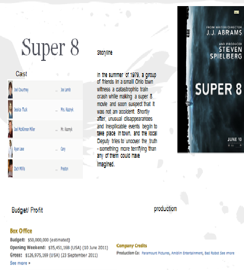
 On slide four, we looked at the film super 8 and how much that made and what it cost etc. The budget was $50,000,000 and in total made $126, 975, 169. This also helped us to decided how much we would spend on our film.
 Slide six is the plot of our film. During this we decided this we decided who we would choose to play each character, We decided that the main character(the teenage girl) would be called Lucy and would be played by Amanda Seyfried. The girls brother would be called Jack and would be played by Ryan Reynolds. The stranger that takes her to the alternate universe would remain nameless and would be played by Benedict Cumberbatch, and the leader/queen of the alternate universe would be played by Tilda Swinton.
 The next slide is what the classification would be. We decided then it would be a 15, however after getting some feedback from the class we have changed it to a rating 12.


Thursday, 16 January 2014

Napoleon Dynamite timeline

00.00 - 00.01 = red carpet
00.01 - 00.06 = plate with food and 'fox searchlight pictures' written in sauce
00.07 - 00.07 = plate taken away
00.08 - 00.09 = white carpet
00.10 - 00.14 = plate with food and 'paramount pictures presents' written in sauce
00.14 - 00.15 = plate taken away
00.15 - 00.16 = blue carpet
00.16 - 00.21 = plate with food and 'in association with mtn films' written in sauce
00.21 - 00.22 = plate taken away
00.23 - 00.24 = shot of wallet
00.25 - 00.29 = shot of UFO abduction card, with 'starring Jon Heder' on it
00.30 - 00.36 = preston high school card
00.37 - 00.38 = green carpet
00.39 - 00.44 = plate of food with 'Jon Gries' written in sauce
00.44 - 00.45 = plate taken away
00.45 -00.46 = green carpet
00.47 - 00.48 = mustardy carpet
00.48 - 00.53 = plate of food with 'Aaron Ruell' written in sauce
00.54 - 00.55 = mustardy carpet
00.56 - 00.56 = green flooring
00.57 - 01.01 = tin of food with 'Efren Ramirez' written in sauce
01.01 - 01.02 = tin taken away
01.02 - 01.03 = green flooring
01.03 - 01.04 = mustardy flooring
01.04 - 01.08 = food with Tina Majorino
01.09 - 01.10 = mustardy flooring
01.10 - 01.11 = wooden flooring
01.12 - 01.15 = ninja star with 'with diedrich bader' written on it
01.16 - 01.16 = wooden flooring
01.17 - 01.17 = blue patterned carpet
01.18 - 01.19 = books placed on carpet
01.19 - 01.20 = book opened
01.20 - 01.26 = takes out library book return card, the card says 'casting by Jory Weitz'
01.26 - 01.27 = put card back
01.27 - 01.28 = open new book
01.29 - 01.34 = takes out library book return card, the card says 'music by John Swihart'
01.35 - 01.36 = put card back
01.36 - 01.37 = pushes books away
01.37 - 01.38 = carpet
01.38 - 01.42 = box of sweets placed on carpet, the box says 'Edited by Jeremy coon'
01.42 - 01.43 = box flicked away
01.43 - 01.45 = beige carpet
01.46 - 01.53 = lip balm with 'Production design by Cory Lorenzen'
01.53 - 01.54 = blue carpet
01.55 - 02.01 = drawing placed onto screen with 'Director of photography Munn Powell'
02.01 - 02.02 = blue carpet
02.02 - 02.03 = beige carpet
02.04 - 02.09 = drawing placed onto screen with 'Executive producer Jory Weitz'
02.10 - 02.11 = mustardy carpet
02.11 - 02.12 = stripey carpet
02.13 - 02.17 = 'produced by Jeremy Coon, Chris Wyatt, Sean Covel' appears on the screen
02.17 - 02.18 = stripey carpet
02.19 - 02.19 = laminate flooring
02.20 - 02.30 = pencils, rubber and protractor placed onto floor with 'Written by Jared Hess and Jekusha Hess' written on it
02.30 - 02.31 = pencils, rubber and protractor wiped away
02.32 - 02.33 = blue carpet 02.33 - 02.37 = plate of food placed down with 'Directed by Jared Hess' written with sauce on it
02.37 - 02.38 = burger bun out on top of burger
02.38 - 04.01 = black screen

Personal analysis: Napoleon Dynamite.

Napoleon Dynamite is a 2004 comedy about a high school student, called Napoleon Dynamite, who lives with his grandmother and his older brother Kip.
 We can tell right from the start of the sequence that Napoleon may live with an elderly person or someone who likes a particular style. We can tell this because the carpets are fairly old fashioned and the colours are very bright and do not stick to one particular colour like what we would expect to see in a modern day household. Also at the start of the clip there is birds chirping in the background which suggests that this film is set somewhere in the suburbs. We can tell this because if it was set in a city there would be the noise of traffic in the background. The fact that it is set in the suburbs could also suggest that nothing exciting ever usually happens there and it's not particularly interesting.

 From this clip we can also tell that the main character is a fairly unhealthy, teenage boy. We can tell this because there is alot of unhealthy foods, and alot of sauce on the plates used at the start, and the foods used throughout the clip are fairly unhealthy. However there is one shot (00.58) where there are some healthier foods, this suggests that Napoleon is trying to be healthy but does not want to give up his fatty, unhealthy foods. There is also a shot (01.39) of a box of sweets, that say 'a fat free food' this also suggests that he is trying to be more healthy but again, does not want to give up on unhealthy foods. The sweets also suggest that he may have fairly bad teeth.
 The shot of the cards in Napoleons wallet (00.25) suggest that he is a bit of a geeky, unpopular character. We can tell this because he has 'UFO abduction insurance'. Not many people are willing to admit that they believe in aliens, so Napoleon can't have many friends as not many people will have that in common with him. Later on in the clip we also see that he has a book about Bigfoot and a book about science, this also suggests that he is geeky and is a skeptic.
 We also learn that Napoleon is fairly organised and doesn't like to be in trouble as he is checking when his borrowed library books are due back, this also suggest he is a bit geeky and likes to read. We can also see that he is organised because later in the clip (02.21) he has school equipment out and is prepared. This again, could make him be seen as geeky. The fact that his pencils are sharp suggests that he like to draw and is always doodling whenever he can.

Monday, 13 January 2014

The Art of the Film Title Throughout Cinema History

Read article, link it to blog and show that you have read and understood it by picking out at least five points which are of interest to you and copying, pasting and commenting on them.


1. 'Note that variations of the director’s name are featured in five ways' I like the that the director has his name featured this many times. I find it interesting that he would choose to do this, and I also wonder why he chose to do this. I think its a very unusual thing to do, I like the way he has used different fonts each time his name has been wrote, I also think its a good idea to include the directors name several time because it makes people more aware of who they are and what they do. I have never seen this been used in a title sequence before, therefore many directors may not like this style and may not like to be that heavily featured.


 2. 'Animation effects like the ones you see in rotoscopes actually pre-date film. But the power of filmmaking was enormous, and it tempted thousands, including many artists, to try their hand at this new medium' I like that filmmaking creates so many opportunities for so many different people in so many different jobs. I think using artists to create title sequences is a great idea as drawings and animations are so interesting to look at. Using artists also allows people to discover new interests and other peoples work.


3. 'The power of minimalism is shown in the opening sequence for Ridley Scott’s “Alien” (1979).' I think its interesting that such a huge film has a not so huge title sequence, when you would've thought that it being a huge film would have a big, expensive title sequence. But it works. I like how simple it is, its not making a big deal of itself and is great for something so simple. It is also something we could consider using for our title sequence, something simple.


4. 'Pixar and Disney have reserved crucial parts in the branding of their films for the title sequences. Using animated characters to introduce viewers to the story became a popular trend. Such talented graphic designers as Susan Bradley (Toy Story, Monsters, Inc., WALL-E, Ratatouille), Jaimi Caliri (Lemony Snicket’s A Series of Unfortunate Events), Dave Nalle (Corpse Bride), Michael Riley (The Back-Up Plan, Kung Fu Panda) and Michael Curtis (Brother Bear) use all manner of tools to test different approaches to designing titles' I like the idea of introducing the characters at an early stage, its a great way to get the audience to connect with the characters early on and to get an idea of what they are like. Its a good idea to get the audience more involved in the title sequence.


 5. 'In the title sequence for “Up in the Air” (2009), the designers at Shadowplay Studios rely on aerial photography.' Aerial photography is a really good to way to present a film called 'up in the air' its clever and relates to the film. Aerial photography is also a good way to show where the film is set. I like this idea, however it would be very hard to do for our own title sequences.