One of the first things we discussed was sans serif and serif fonts. Sans serif fonts are fonts without serifs (the edgy bits) at the end of strokes, these fonts are commonly associated with western/FBI/police films. Serif fonts are the opposite; fonts with serifs at the edge.
The first title sequence we looked at was the 'Catch me if you can' title sequence. http://www.artofthetitle.com/title/catch-me-if-you-can/
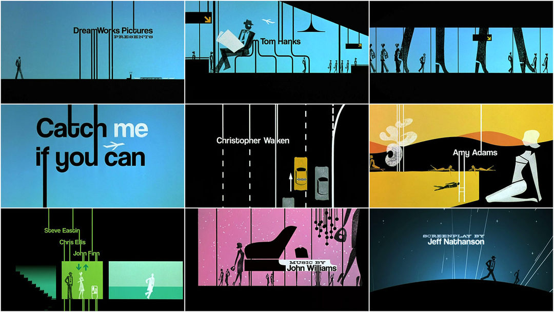 We found that the flow from each of the names was very smooth but there was constant movement, the smooth constant moving could represent the main character in the film. He is always changing his identity, however he is smooth so that nobody notices what he is doing, another thing that gives us this idea is the fact that throughout the title sequence the main character is seen in many different occupations, suggesting he is always moving and always changing. The font used is also a Sans serif font which again suggests the main character is smooth. We can also notice that this title sequence has been influenced by Saul Bass as there are alot of straight lines used to fit into the scene, which is similar to what Saul Bass does.
The next title sequence we looked at was the 'Lord of war' title sequence. http://www.artofthetitle.com/title/lord-of-war/
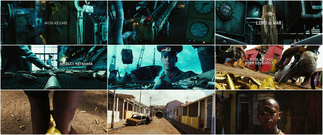 In this title sequence the names of the big stars and the main crew are focused to the centre and the other cast & crew are not as noticeable as they are put to the side. We also noticed that the writing is white and fairly small, this means that it is not the main focus, when we watched it we all found ourselves focusing on the story of the bullet in the background and not what the text was saying. The text itself is also in capital letters which suggests the seriousness of the film.
Th next and last title sequence we looked at was 'Forrest Gump' http://www.artofthetitle.com/title/forrest-gump/
 Throughout this entire sequence the names were centred, this shows that is what the audience is supposed to be focusing on. The font used is a serif font, this suggests the film is set in the past as serif fonts are associated with the past and old newspapers. The background is also not too busy so it is easy to read. There is also a very gentle feeling to the sequence, the fact that there is also a feather floating around in the background makes this calm and gentle than the other two sequences we watched.
No comments:
Post a Comment